 07719299596

07719299596


A tricky revamp of our website was handled well by BinaryWebs and we are very pleased with the progress which is an ongoing process. Changing from a massive ecommmerce based website to a smaller lead generation based website has been a great success for our business.
Richard Maxwell - RaceScene
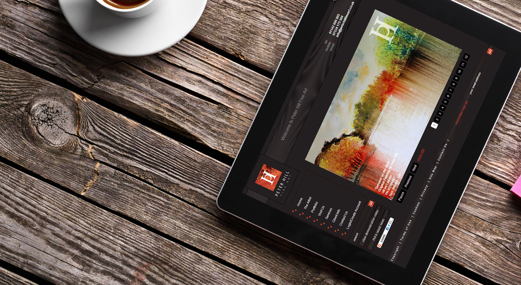
Following lots of very fruitful meetings we got the website design looking perfect and also the admin area better than we could have ever hoped for! The end result is a great website that fits in with the high level our customers have come to expect from our business and also improved efficiency of our work through using the admin function put in place.
David Allott - Peter Hill Fine Art
There used to be a time when planning a mobile optimised website meant having 2 physically seperate websites, thankfully thats no longer the case. With the advent of HTML5 and CSS3 we can now dynamically change the layout and style of a website entirely based on screen size, type of device, or a devices capabilities.
For instance when a desktop user looks at a website navigational links all on display are bonus and aids the useability of your site for that user but likewise a mobile device's web browser doesn't afford the physical space to display those links in the same manner.
For the mobile user you may want to use a single drop down menu thats not necsassarily on display the whole time.
When combined with a responsive design you have the ultimate experience for both traditional desktop users and mobile users are no longer an after thought.

For more information please see our contact details or click here to display our contact form.
We build websites with your business goals in mind
Through good communication we don't just build pretty websites, we build websites that give your business a good return on investment.
 We listen
 Creative and technical
 Experience
 Passionate
We are always available, get in touch with us now
 0114 3601110
07719 299 596


